Feeds:
Posts
Comments

Archive for the ‘Image Slider’ Category

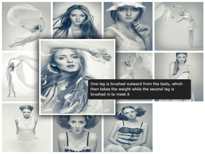
A lightweight filterable image grid module with support of light-box gallery. This is a responsive module, the grid and gallery will adjust according to the screen size. Clicking any image in the grid will show the full version of image in a light-box gallery with thumbnails and navigation support. You can use this module to showcase your project and portfolio items.

This blog post will describe the simple steps on how to use Responsive Filterable Image Gallery module in DotNetNuke portals.

View Live Demo

If you or your client has worked in the field for a while, there is a pretty good chance that you have a rather extensive portfolio. To make it a little easier to navigate, you will probably be tempted to break them into different categories. This module will help you to show the filterable portfolio items in an interactive and stylish way.

This module is also useful for photographers to show their work in style.

Step-1: Install Module

Once you have downloaded Responsive Filterable Image Gallery, you can install it in your portal by logging in as Host and going to Host -> Module Definitions -> Install Module. If you are not familiar with DotNetNuke module installation, please read following articles:

Step-2: Add Module to a Page

Once the module is installed, it will be available in the Module drop-down. You can add this module (DZ_ResponsiveFilterableImageGallery) to your desired pane.

Step-3: Module Settings

After adding the module, you can go to module settings page and scroll to bottom section “Image Gallery Settings”. This section contains settings specific to this module. See following screen for setting details.

Following table describes the available settings.

Setting Description
Randomize Images Select this check-box, if you want a random image order on each page load.
Image Width Specify the width for images. Images can be of different dimension but width would be same. The aspect ratio would be maintained.
Image Margin Specify the margin between grid items
Image Border Radius If you want to display radius border, you can specify thickness of the radius, specifying 0px will not display any radius.
Tag Position Select the position of tabs
Tags Color Choose color for tag text
Active Tag BG Choose background color for the selected tab
Active Tag Color Choose color for the selected tab
Gallery Theme Choose from list of available themes for the light-box gallery
Show Overlay Gallery Select this option to show thumbnails in the gallery view
No Filter on Gallery Select this option, if you want to always show all images in the gallery view. Not selecting this option will only show filtered images in the gallery view.
 Show Title  Select this option to show title in the gallery view
 Auto Play  Select this option to auto-play the gallery in the light-box view
 Auto Play Delay  Specify the time for auto-play in milliseconds

Step-4: Manage Images

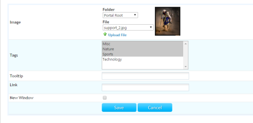
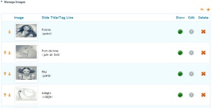
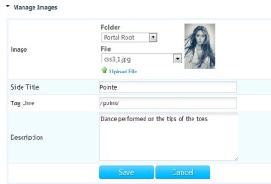
Now you are ready to add images to the slider. You can click the “Manage Images (Pencil Icon)” link on the newly added module. This will show you image listing, you can upload images. You can specify slide title, tag line and description for each image. See following screens for reference.

Manage Images

Manage Images – Add New

Manage Images – Tags

Step-5: Responsive Filterable Image Gallery View

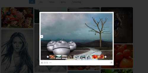
You are all set – now you can go back to the page where you added the module and now you can see the Responsive Filterable Image Gallery in action.

Filterable Grid View

Gallery View

Read Full Post »

A jQuery based DNN module that will create a booklet-like component that let’s you navigate through its items by flipping the pages.

A jQuery based DNN module that will create a booklet-like component that let’s you navigate through its items by flipping the pages.

You can add images to this module and it will display images with flip-book transitions. Light-box gallery support is also available with this module.

View Live Demo

Step-1: Install Module

Once you have downloaded Image Slider with Flip Book Navigation, you can install it in your portal by logging in as Host and going to Host -> Module Definitions -> Install Module. If you are not familiar with DotNetNuke module installation, please read following articles:

Step-2: Add Module to a Page

Once the module is installed, it will be available in the Module drop-down. You can add this module (DZ_ImageFlipBook) to your desired pane.

Add Module to a DotNetNuke Page

Add Module to a DotNetNuke Page

Step-3: Module Settings

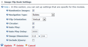
After adding the module, you can go to module settings page and scroll to bottom section “Image Flip Book Settings”. This section contains settings specific to this module. See following screen for setting details.

Module Settings

Module Settings

Following table describes the available settings.

Setting Description
Randomize Images Select this check-box, if you want a random image order on each page load.
Flip Orientation Choose between vertical and horizontal flip transition
Circular Select this check-box to move back to first slide after the last one
Auto Play Select this check-box to start auto-play on page load
Auto Play Delay Specify the time (milliseconds) for auto-play
Image Dimension Specify the width and height for the slider area

Step-4: Manage Images

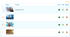
Now you are ready to add images to the slider. You can click the “Manage Images (Pencil Icon)” link on the newly added module. This will show you image listing, you can upload images. You can specify slide title, tag line and description for each image. See following screens for reference.

Manage Images

Manage Images

Add Image

Add Image

Step-5: Image Slider with Flip Book Navigation View

You are all set – now you can go back to the page where you added the module and now you can see the Image Slider with Flip Book Navigation in action.

Image Slider View

Flip Book Transition

Flip Book Transition

Read Full Post »

This is a continuous jQuery based image carousel. This simple to use module will help you to add auto rotating images, logos, portfolios on your DotNetNuke portals.

This blog post will describe the simple steps on how to use Image Carousel for DotNetNuke module in DotNetNuke portals.

View Live Demo

Step-1: Install Module

Once you have downloaded Image Carousel for DotNetNuke, you can install it in your portal by logging in as Host and going to Host -> Module Definitions -> Install Module. If you are not familiar with DotNetNuke module installation, please read following articles:

Step-2: Add Module to a Page

Once the module is installed, it will be available in the Module drop-down. You can add this module (DZ_ImageCarousel) to your desired pane.

Add Module to a DotNetNuke Page

Add Module to a DotNetNuke Page

Step-3: Module Settings

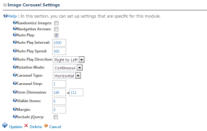
After adding the module, you can go to module settings page and scroll to bottom section “Image Carousel Settings”. This section contains settings specific to this module. See following screen for setting details.

Module Settings

Module Settings

Following table describes the available settings.

Setting Description
Randomize Images Select this check-box, if you want a random image order on each page load.
Navigation Arrows Select to show navigation arrows
Auto Play Select to auto play the carousel items on page load
Auto Play Interval Specify the auto play interval in milli-seconds
Auto Play Speed Specify the auto play speed in milli-seconds
Auto Play Direction Select the auto play direction
Rotation Mode Select the rotation mode for carousel items
Carousel Type Select the orientation of the carousel
Carousel Step Specify number of items to move on each carousel step
Item Dimension Specify the width x height for each carousel item. All items added to carousel should be of same width and height
Visible Items Specify number of items that will be visible at one point in time
Margin Specify the spacing between the grid items

Step-4: Manage Images

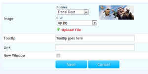
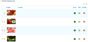
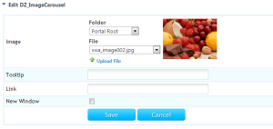
Now you are ready to add images to the slider. You can click the “Manage Images (Pencil Icon)” link on the newly added module. This will show you image listing, you can upload images. You can specify slide title, tag line and description for each image. See following screens for reference.

Manage Items

Manage Images

Add Carousel Item

Add Carousel Item

Step-5: Image Carousel for DotNetNuke View

You are all set – now you can go back to the page where you added the module and now you can see the Image Carousel for DotNetNuke in action.

Carousel with Single Image

Carousel with Single Image

Carousel with 6 Items - Scrolling Logos

Carousel with 6 Items – Scrolling Logos

Read Full Post »

A lightweight image grid module with support of modal light-box window which uses only CSS3 for silky-smooth animations and transitions. Image grid is loaded using stylish flip transition. Clicking any image in the grid will show the full version of image in a light-box gallery with thumbnails and navigation support. You can use this module to showcase your large set of images.

This blog post will describe the simple steps on how to use Image Grid with Stylish Light-box Gallery module in DotNetNuke portals.

View Live Demo

Step-1: Install Module

Once you have downloaded Image Grid with Stylish Light-box Gallery, you can install it in your portal by logging in as Host and going to Host -> Module Definitions -> Install Module. If you are not familiar with DotNetNuke module installation, please read following articles:

Step-2: Add Module to a Page

Once the module is installed, it will be available in the Module drop-down. You can add this module (DZ_ImageGridWithLightBox) to your desired pane.

Add Module to a DotNetNuke Page

Add Module to a DotNetNuke Page

Step-3: Module Settings

After adding the module, you can go to module settings page and scroll to bottom section “Image Grid with Light-Box Settings”. This section contains settings specific to this module. See following screen for setting details.

Module Settings

Module Settings

Following table describes the available settings.

Setting Description
Randomize Images Select this check-box, if you want a random image order on each page load.
Container Width Specify the width for the main grid container
Thumbnail Dimension Specify the width and height for each thumbnail image
Margin Specify the spacing between the grid items
Hover Zoom Scale Specify the zoom scale when mouse is moved over thumbnails

Step-4: Manage Images

Now you are ready to add images to the slider. You can click the “Manage Images (Pencil Icon)” link on the newly added module. This will show you image listing, you can upload images. You can specify slide title, tag line and description for each image. See following screens for reference.

Manage Items

Add Grid Item

Add Grid Image

Step-5: Image Grid with Stylish Light-box Gallery View

You are all set – now you can go back to the page where you added the module and now you can see the Image Grid with Stylish Light-box Gallery in action.

Thumbnail Grid View

Thumbnail Grid View

Thumbnail Grid View - On Image Hover

Thumbnail Grid View – On Image Hover

Light-box View

Light-box View

Read Full Post »

This is a neat light-box effect using only CSS. The idea is to have some thumbnails that are clickable, and once clicked, the respective large image is shown. Using CSS transitions and animations, we can make the large image appear in a fancy way.

This blog post will describe the simple steps on how to use Image Gallery with CSS3 Light-box module in DotNetNuke portals.

View Live Demo

Step-1: Install Module

Once you have downloaded Image Gallery with CSS3 Light-box, you can install it in your portal by logging in as Host and going to Host -> Module Definitions -> Install Module. If you are not familiar with DotNetNuke module installation, please read following articles:

Step-2: Add Module to a Page

Once the module is installed, it will be available in the Module drop-down. You can add this module (DZ_GalleryWithCSS3Lightbox) to your desired pane.

Add Module to a Page

Step-3: Module Settings

After adding the module, you can go to module settings page and scroll to bottom section “Gallery with CSS3 Lightbox Settings”. This section contains settings specific to this module. See following screen for setting details.

Module Settings

Module Settings

Following table describes the available settings.

Setting Description
Randomize Images Select this check-box, if you want a random image order on each page load.
Show Next/Previous  Select to show next and previous buttons in the light-box view.
Container Width Specify the width for the gallery view – if you want to make the gallery view responsive, specify the width in percentage (e.g. 100%)
Transition Select the transition effect for light-box and navigation. Following transitions are supported:

  1. Zoom In
  2. Zoom Out
  3. Fade
Thumbnail Size Specify the width x height for the thumbnails to be shown in module view
Border Size Specify the border thickness for the thumbnails
Border Radius Specify the border radius for thumbnails
Background Color Choose the background color for thumbnail border – the same color will be used in the light-box view with opacity.

Step-4: Manage Images

Now you are ready to add images to the slider. You can click the “Manage Images (Pencil Icon)” link on the newly added module. This will show you image listing, you can upload images. You can specify slide title, tag line and description for each image. See following screens for reference.

Manage Items

Manage Items

Add Grid Item

Add Grid Image

Step-5: Image Gallery with CSS3 Light-box View

You are all set – now you can go back to the page where you added the module and now you can see the Image Gallery with CSS3 Light-box in action.
Thumbnail Grid View

Thumbnail Grid View

Light-box View

Light-box View

Light-box View - Notes

Light-box View – Notes

Read Full Post »

Nice looking image slider module by DnnZone. It is not just another slider but a slider with support for touch devices. This slider recognizes the Swipe Touch event – so this can be use on modern touch devices including: iPhone, iPad and Android Devices.

Its a nice looking image slider module by DnnZone. It is not just another slider but it is a slider with support for touch devices. This slider recognizes the Swipe Touch event – so this can be use on modern touch devices including:

  • iPhone
  • iPad
  • Android Devices

Simple horizontal slide transition is supported with easing effects.

This module is built using HTML, CSS and Java-script only. No Flash is used.

This blog post will describe the simple steps on how to use Swipe to Slide module in DotNetNuke portals.

View Live Demo

Step-1: Install Module

Once you have downloaded Swipe to Slide, you can install it in your portal by logging in as Host and going to Host -> Module Definitions -> Install Module. If you are not familiar with DotNetNuke module installation, please read following articles:

Step-2: Add Module to a Page

Once the module is installed, it will be available in the Module drop-down. You can add this module (DZ_SwipeToSlide) to your desired pane.

Add Module to a Page

Step-3: Module Settings

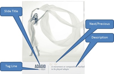
After adding the module, you can go to module settings page and scroll to bottom section “Swipe to Slide Settings”. This section contains settings specific to this module. See following screen for setting details.

Module Settings

Module Settings

You can customize the settings for this module, including:

  • Dimensions
    • Width
    • Height
  • Alignment
    • Left
    • Center
    • Right
  • Auto Play
    • Auto Play Duration
    • Pause on Hover
  • Show Next/Previous
    • Show on Hover
    • Show on Last Sider
  • Bullets Position
    • Top
    • Bottom
  • Transition Speed
  • Easing Effect
  • Randomize Items

Step-4: Manage Images

Now you are ready to add images to the slider. You can click the “Manage Items (Pencil Icon)” link on the newly added module. This will show you image listing, you can upload images. You can specify title, background color for hover effect and the URL. See following screens for reference.

Manage Items

Manage Items

Add New Image

Add New Image

Step-5: Slider View

You are all set – now you can go back to the page where you added the module and now you can see the Swipe to Slide in action.

Swipe to Slide - Nice Slider with support for iPhone, iPad & Android

Swipe to Slide - Nice Slider with support for iPhone, iPad & Android

Read Full Post »

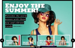
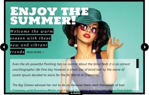
A new interactive slider module by DnnZone. It can show heading, sub-heading and description in each slide using thumbnail or slider view mode. In slider view an extra (optional) description field is displayed in nice scrolling area. Navigation arrows work according to the selected view.

This blog post will describe the simple steps on how to use Fancy Content Rotator module in DotNetNuke portals.

View Live Demo

Step-1: Install Module

Once you have downloaded Fancy Content Rotator, you can install it in your portal by logging in as Host and going to Host -> Module Definitions -> Install Module. If you are not familiar with DotNetNuke module installation, please read following articles:

Step-2: Add Module to a Page

Once the module is installed, it will be available in the Module drop-down. You can add this module (DZ_FancyContentRotator) to your desired pane.

Add Module to a Page

Step-3: Module Settings

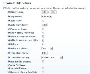
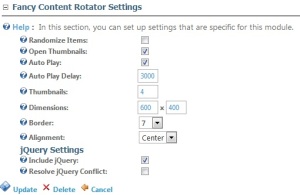
After adding the module, you can go to module settings page and scroll to bottom section “Fancy Content Rotator Settings”. This section contains settings specific to this module. See following screen for setting details.

Module Settings

Module Settings

Following table describes the available settings.

Setting Description
Randomize Images Select this check-box, if you want a random image order on each page load.
Open Thumbnails Select this check-box, if you want to show thumbnails view on page load.
Auto Play Select this check-box, if you want to auto play the slider
Auto Play Delay Specify the delay between slides during auto play (milli-seconds)
Thumbnails Specify the number of thumbnails per set for thumbnails view
Dimensions Specify the width and height of the slider area
Border Specify the border thickness.

Step-4: Manage Images

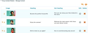
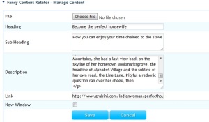
Now you are ready to add images to the slider. You can click the “Manage Content (Pencil Icon)” link on the newly added module. This will show you image listing, you can upload images. You can specify heading, sub-heading, description, link and order of display for images in this section. See following screens for reference.

Manage Images

Manage Images

Add Image

Add Image

Step-5: Fancy Content Rotator View

You are all set – now you can go back to the page where you added the module and now you can see the Fancy Content Rotator in action.

Fancy Content Rotator - Thumbnails View

Fancy Content Rotator - Thumbnails View

Fancy Content Rotator - Slider View

Fancy Content Rotator - Slider View


Possible Issues and Quick Resolution

Slider not working:

Make sure jQuery 1.5+ is available in your DNN portal. If you are not sure, turn on the check-box “Include jQuery” from module setting page.

Conflict with other java-script frame-works:

This module relies on jQuery, if your portal is also using other java-script frameworks (like moo-tools or prototype etc.), you should select the check box “Resolve Conflict” in module settings.

On DNN 04.xx.xx, please always select the “Resolve Conflict” settings.


Read Full Post »

DNN module that can be used to show set of images/banners with a nice looking scrolling effect. This module will help you to make the banner section more interactive and will allow you to show multiple images in the space of one image. This module can also be used as a product show-case.

This blog post will describe the simple steps on how to use Smooth Image Scroler module in DotNetNuke portals.

View Live Demo

Step-1: Install Module

Once you have downloaded Smooth Image Scroller, you can install it in your portal by logging in as Host and going to Host -> Module Definitions -> Install Module. If you are not familiar with DotNetNuke module installation, please read following articles:

Step-2: Add Module to a Page

Once the module is installed, it will be available in the Module drop-down. You can add Smooth Image Scroller (DZ_SmoothImageScroller) to your desired pane.

Add Module to a Page

Add Module to a Page

Step-3: Module Settings

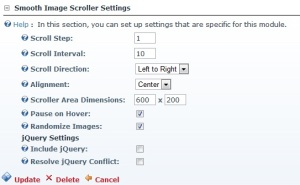
After adding the module, you can go to module settings page and scroll to bottom section “Smooth Image Scroller Settings”. This section contains settings specific to this module. See following screen for setting details.

Module Settings

Module Settings

Following table describes the available settings.

Include jQuerySelect this check-box, if jQuery is not already available in the portal

Setting Description
Scroll Step Determines how many pixels the scrollable area should move in each scrolling cycle
Scroll Interval Determines the elapsed time between each call to the autoscrolling function
Scroll Direction Select scroll direction:

  • Left to Right
  • Right to Left
Alignment Select horizontal alignment of scroller:

  • Left
  • Center
  • Right
Pause on Hover Select to pause scrolling effect when mouse is moved over the scrolling area
Scroller Dimensions Specify the width and height of the scroller
Randomize Images Select this check-box, if you want a random image order on each page load.

Step-4: Manage Images

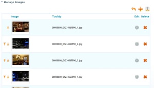
Now you are ready to add images to the slider. You can click the “Manage Images (Pencil Icon)” link on the newly added module. This will show you image listing, you can upload images. You can specify caption and order of display for images in this section. See following screens for reference.

Manage Images

Manage Images

Add Image

Add Image

Step-5: Smooth Image Scroller View

You are all set – now you can go back to the page where you added the module and now you can see the Smooth Image Scroller in action.
Smooth Image Scroller

Smooth Image Scroller


Possible Issues and Quick Resolution

Slider not working:

Make sure jQuery 1.4+ is available in your DNN portal. If you are not sure, turn on the check-box “Include jQuery” from module setting page.

Conflict with other java-script frame-works:

This module relies on jQuery, if your portal is also using other java-script frameworks (like moo-tools or prototype etc.), you should select the check box “Resolve Conflict” in module settings.

On DNN 04.xx.xx, please always select the “Resolve Conflict” settings.


Credits:

This module is based on an open source jQuery Plugin “Smooth Div Scroll” by Thomas Kahn

Copyright © 2010 Thomas Kahn – thomas(at)karnhuset(dot)net

Read Full Post »

Fancy Slide Sow is a jQuery based image gallery and slide show for DotNetNuke portals. It allows to create outstanding sliding image slide show. Look and feel of this slide show was inspired by BlackBerry’s PlayBook.

This blog post will describe the simple steps on how to use Fancy Slide Show module in DotNetNuke portals.

View Live Demo

Step-1: Install Module

Once you have downloaded Fancy Slide Show, you can install it in your portal by logging in as Host and going to Host -> Module Definitions -> Install Module. If you are not familiar with DotNetNuke module installation, please read following articles:

Step-2: Add Module to a Page

Once the module is installed, it will be available in the Module drop-down. You can add Fancy Slide Show (DZ_FancySlideShow) to your desired pane.

Add Module to a Page

Add Module to a Page

Step-3: Module Settings

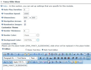
After adding the module, you can go to module settings page and scroll to bottom section “Fancy Slide Show Settings”. This section contains settings specific to this module. See following screen for setting details.

Module Settings

Module Settings

Following table describes the available settings.

Setting Description
Auto Play Duration Specify the duration (in seconds) for auto play. Enter 0, if you don’t want auto play.
Transition Speed Specify the transition speed in milliseconds.
Dimensions Specify the width and height for the slider area. Please note, slider will not resize images, images should be of the same size.
Navigation Arrows Choose to show/hide the next previous arrows.
Randomize Images Select this check-box, if you want a random image order on each page load.
Border Thickness Specify the border thickness around the slide show container.
Border Color Choose the border color
Background Color Choose the slide show background color
Container HTML You can write your custom HTML. It can serve as wrapper around the slider. Use [DNN_FANCY_SLIDESHOW] in a place where you want to show the actual slide show.
Include jQuery Select this check-box, if jQuery is not already available in the portal
Resolve jQuery Conflict Select this check-box, if you are also using other java-script frameworks.

Step-4: Manage Images

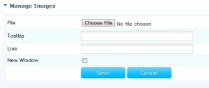
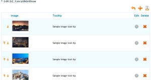
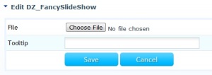
Now you are ready to add images to the slider. You can click the “Manage Images (Pencil Icon)” link on the newly added module. This will show you image listing, you can upload images. You can specify caption, link and order of display for images in this section. See following screens for reference.

Manage Images

Manage Images

Add Image

Add Image

Step-5: Slide Show View

You are all set – now you can go back to the page where you added the module and now you can see the Fancy Slide Show in action.

Fancy Slide Show

Fancy Slide Show

Possible Issues and Quick Resolution

Slider not working:

Make sure jQuery 1.4.x or later is available in your DNN portal. If you are not sure, turn on the check-box “Include jQuery” from module setting page.

Conflict with other java-script frame-works:

This module relies on jQuery, if your portal is also using other java-script frameworks (like moo-tools or prototype etc.), you should select the check box “Resolve Conflict” in module settings.

On DNN 04.xx.xx, please always select the “Resolve Conflict” settings.

Read Full Post »

Special Image Slider is a nice module by DnnZone. It can be used to slide images using 23 unique transition effects. Special feature of this slider module is that you can also choose transition effect for each slide. Different styles of navigation bullets are also supported.

This blog post will describe the simple steps on how to use Special Image Slider module in DotNetNuke portals.

View Live Demo

Step-1: Install Module

Once you have downloaded Special Image Slider, you can install it in your portal by logging in as Host and going to Host -> Module Definitions -> Install Module. If you are not familiar with DotNetNuke module installation, please read following articles:

Step-2: Add Module to a Page

Once the module is installed, it will be available in the Module drop-down. You can add Special Image Slider (DZ_SpecialImageSlider) to your desired pane.

Add Module to a Page

Add Module to a Page

Step-3: Module Settings

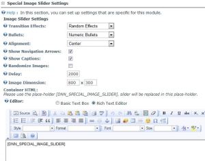
After adding the module, you can go to module settings page and scroll to bottom section “Special Image Slider Settings”. This section contains settings specific to this module. See following screen for setting details.

Module Settings

Module Settings

Following table describes the available settings.

Setting Description
Effects You have the option to select Slide Level, Random or a specific transition effects for your slider. Following unique transition effects can be selected:

  • Cube
  • Cube Random
  • Block
  • Cube Stop
  • Cube Hide
  • Cube Size
  • Horizontal
  • Show Bars
  • Show Bars Random
  • Tube
  • Fade
  • Fade Four
  • Paralell
  • Blind
  • Blind Height
  • Blind Width
  • Direction Top
  • Direction Bottom
  • Direction Right
  • Direction Left
  • Cube Stop Random
  • Cube Spread
  • Cube Jelly
Bullets Bullets style, choose from:

  • None
  • Circular Bullets
  • Numeric Bullets
  • Thumbnails
Navigation Arrows Show next/previous arrows
Caption Show image captions, if specified in image properties
Randomize Images Select this check-box, if you want a random image order on each page load.
Delay Time between slide transitions (milliseconds)
Image Dimension Specify the width and height for the slider area. Please note, slider will not resize images, images should be of the same size.
Container HTML You can write your custom HTML. It can serve as wrapper around the slider. Use [DNN_SPECIAL_IMAGE_SLIDER] in a place where you want to show the actual slider.
Include jQuery Select this check-box, if jQuery is not already available in the portal
Resolve jQuery Conflict Select this check-box, if you are also using other java-script frameworks.

Step-4: Manage Images

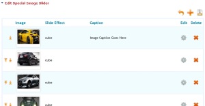
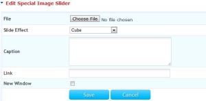
Now you are ready to add images to the slider. You can click the “Manage Images (Pencil Icon)” link on the newly added module. This will show you image listing, you can upload images. You can specify caption, link and order of display for images in this section. See following screens for reference.
Manage Images

Manage Images

Add Image

Add Image

Step-5: Image Slider View

You are all set – now you can go back to the page where you added the module and now you can see the Special Image Slider in action.

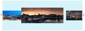
Special Image Slider with 23 Effects

Special Image Slider with 23 Effects

Possible Issues and Quick Resolution

Slider not working:

Make sure jQuery 1.4.x or later is available in your DNN portal. If you are not sure, turn on the check-box “Include jQuery” from module setting page.
Conflict with other java-script frame-works:

This module relies on jQuery, if your portal is also using other java-script frameworks (like moo-tools or prototype etc.), you should select the check box “Resolve Conflict” in module settings.

On DNN 04.xx.xx, please always select the “Resolve Conflict” settings.

Images are not displayed well inside slider:

Please make sure all images added to the slider are of the same size. Please use the same dimensions in module settings.

Read Full Post »

Older Posts »