Show your team in a stylish team showcase module using 9 available styles. We will be adding more styles in future and you will get free updates. This is a light-weight module that only rely on CSS and HTML, no java-script is used.
This blog post will describe the simple steps on how to use Stylish Team Showcase module in DotNetNuke portals.
Show your team in a stylish team showcase module using 9 available styles. We will be adding more styles in future and you will get free updates. This is a light-weight module that only rely on CSS and HTML, no java-script is used.
This module is responsive and you can choose the responsive settings for Desktop, Tablet and Mobile views.
For each team-member, you can specify Name, Position/Title, Phone Number, Short Intro and Social Media links. You can also provide a link to profile on the site if you are maintaining a detail page of the team member.
You can define team member’s data once and then re-use it on different modules.
Step-1: Install Module
Once you have downloaded Stylish Team Showcase, you can install it in your portal by logging in as Host and going to Host -> Module Definitions -> Install Module. If you are not familiar with DotNetNuke module installation, please read following articles:
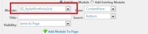
Step-2: Add Module to a Page
Once the module is installed, it will be available in the Module drop-down. You can add this module (DZ_TeamShowcase) to your desired pane.

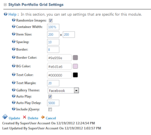
Step-3: Module Settings
After adding the module, you can go to module settings page and scroll to bottom section “Team Showcase Settings”. This section contains settings specific to this module. See following screen for setting details.

Following table describes the available settings.
| Setting | Description |
|---|---|
| Randomize Team Members | Select this check-box, if you want a random order of team members on each page load. |
| Include Bootstrap | Select this check-box, if bootstrap is not included of DNN Skin |
| Include Font Awesome | Select this check-box, if font awesome is not included in DNN Skin |
| Desktop Columns | Number of columns on Desktop browsers |
| Tablet Columns | Number of columns on Tablets |
| Mobile Columns | Number of columns on Mobiles |
| Team Datasource | In case of we want to re-use team members defined in one module on different places. |
| Team Showcase Style | Choose a style for Team Showcase:
|
Step-4: Manage Team
Now you are ready to add team members. You can click the “Manage Team (Pencil Icon)” link on the newly added module. This will show you team members listing, you can add/edit team members here.

Manage Team

Manage Team – Add New
Step-5: Stylish Team Showcase
You are all set – now you can go back to the page where you added the module and now you can see the Stylish Team Showcase in action.

Stylish Team Showcase


 DnnZone